Media City Bergen/NCE Media hosted the conference, with contributions from The Norwegian Center for Investigative Journalism and the Rafto Foundation for Human Rights.
– Today, we will all learn more about data journalism in practice. Hacking is about exploration, not exploitation. So what’s more proper than inviting a “real hacker” to the stage, says Ketil Moland Olsen from the Media City Bergen/NCE Media as he opens the conference.

Using UK intelligence tools
The “hacker” in question is Vegard Vaage from Netsecurity, who spoke about using UK intelligence tools for “fun and profit.” GCHQ is the UK’s intelligence, security and cyber agency. Their tool CyberChef is free and open for everyone to use.
– It's a unique tool. It's safer to use than Google or using some other online service. You can download and use it on your computer, says Vaage. He recommends CyberChef if you have a lot of data you want to analyse or clean. It works with many different programming languages, translates code between them, and can even detect computer viruses.
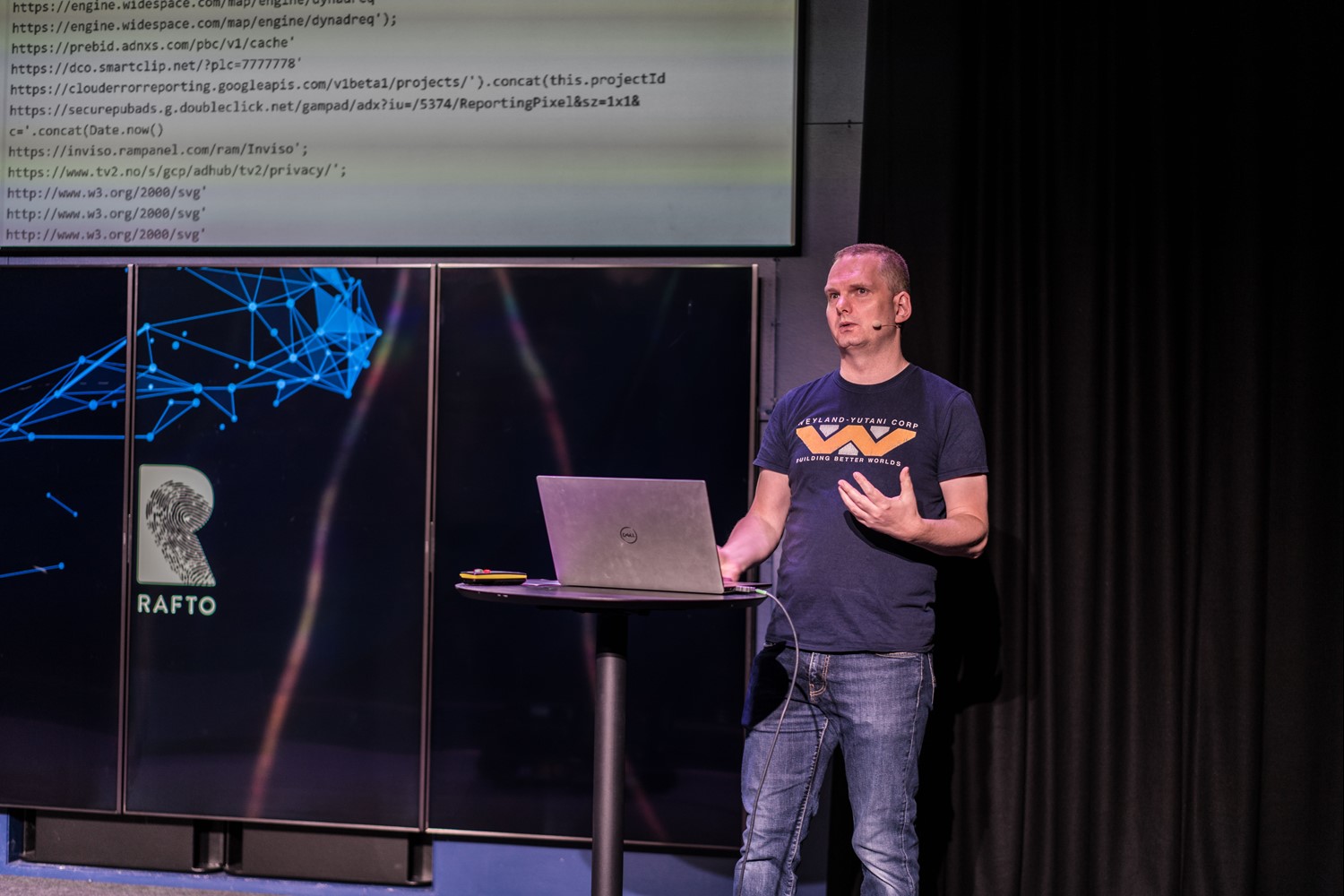
– If you get an email attachment you don’t know if you can trust, you can open it by using CyberChef. It can help you with a million things, says Vaage to the audience.
Comparing drugs and data
Sergej Stoppel from Wolftech shared his ideas on how we can present data more clearly, and the importance of correct visualisation. The title of his presentation was “You don’t need drugs to hallucinate, sometimes data is just enough”.
– We can’t address problems if we don’t see them, says Stoppel.
When presenting data material, the visualisation must be clear and correct so problems and challenges can be seen – and hopefully solved.
– When misusing data visualisation, you show things that don’t exist, he points out.

Stoppel mentions examples of politically motivated data presentations from Russian and American media. Norway and Europe have less of this so far, says Stoppel.
– It’s essential to keep this in mind: Are crucial data changes well reflected through noticeable visual changes?
How the geeks collaborate with their colleagues
Anders Grimsrund Eriksen and Lasse Lambrechts from Bergens Tidende explained: “How not to fall on your face while working with data”. In other terms, why it’s crucial to have an open and transparent dialogue with your non-geek colleagues and leaders.
– If we just show code, the rest of the journalists don't understand. We have to ensure everyone gets what we are doing, says Lambrechts.
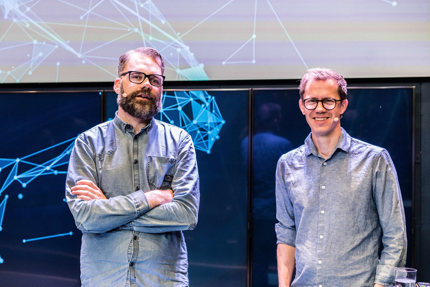
The two data journalists use a solution called Jupyter Notebook. By documenting their process as code in digital notebooks, readable stories and graphics are combined in a way that makes it possible for their co-workers to understand.
– Excel is just too much magic; many things are hidden there. We don't use Excel anymore. In Jupyter, you document everything in a way that’s both possible to explain and understand, says Grimsrud Eriksen.
The search for the missing data
Maria Gargiulo is a statistician from the Human Rights Data Analysis Group (HRDAG). HRDAG was awarded the Rafto Prize for their work in 2021.
“Through the innovative use of statistics and computer technology, 2021’s Rafto Laureates have documented widespread human rights violations, uncovered abuses that would have otherwise gone undetected and helped bring perpetrators to justice”, the Rafto jury stated in their decision.
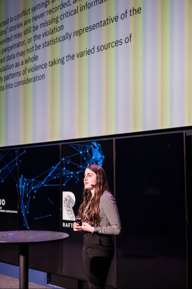
In her MCB Hack presentation “Missing data challenges in the human rights research”, Gargiulo emphasized the importance of data that are not yet found.
– It can be challenging and dangerous to collect data. Information might be missing. Our goal is to study patterns of violence and take into account the various sources of missing data.
She mentioned an example: Documented disappearances in Columbia.
In such cases, there can be three types of missing data: The name of the person who disappeared, the location, and the perpetrator.
– When putting all the documented data together, we can estimate things we do not know anything about, says Gargiulo.
She advises journalists to look at the Tech Corner on the HRDAG website.
– This is where we collect the deeper and geekier content we create, Gargiulo concludes.
Journalistic innovation, AI and big data
Jenny Wiik from the University of Gothenburg invites journalists to work with AI and Big Data to share competence and innovate.
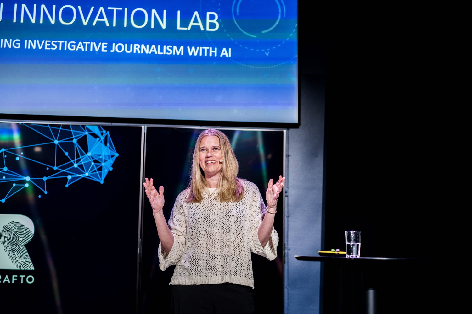
Wiik works for the Swedish Medier & demokrati, a national collaboration platform for media innovation and social research. Their goal is to strengthen the media’s innovative strength, journalism, public discourse and democracy, and a high-priority area for the platform is media-related AI innovation.
Medier & demokrati wants to establish a European testbed for investigative journalism and AI skills, facilitate methodological development for later dissemination to a broader community, and contribute to advanced technical and journalistic innovation projects.
– There is an increasing amount of available data. We need to collaborate to understand it.
We want to spread information to more people and more newsrooms – also smaller newsrooms. We want to bring journalism and competence together, says Wiik.
Verification of videos from Ukraine
Eirik Solheim from NRKbeta explained how Norwegian news media work on verifying videos from Ukraine.
– It’s a puzzle to verify the videoes. I continue to search for answers after I have left work for the day. It is an exciting process, says Solheim.
After the war in Ukraine started, NRK set up a dedicated project team. Solheim shows a video from Mariupol in Ukraine as an example and lists the team's first questions to answer.
– Is this Mariupol? Are there Ukrainian soldiers in Mariupol?
In a specific example, they looked for clues from buildings, such as unique roof shapes, and found something that looked like an address on a sign on a building.
– We found a catalog with all the street names and translated them into Cyrillic language. Then we saw the correct road.
Historical weather data and satellite photos have also been influential in the verification work. They verify some of the videos in a couple of hours. But occasionally, more time was needed, like up four or five hours.
NRK used different tools to make the process as efficient as possible. For instance, they found that Google Lens is an excellent way to perform real-time translations. It was much faster than copying or typing the text into Google Translate.

Some in the audience ask: – Do you verify every video?
– Yes, we verify every video we publish. And we inform the readers and viewers that it has been verified, says Solheim.
Young people and facts
Gaute Kokkvoll from Factiverse and Ketil Moland Olsen from Media City Bergen talked about their project “Stimulating young people’s news consumption with facts.”
Factiverse, Media City Bergen, and the newspapers Dagens Næringsliv, Stavanger Aftenblad and Fædrelandsvennen collaborated on the project. They aimed to get young people to read more and use micro-facts to make the article more exciting and understandable. Their solution employed a simple algorithm to enrich the online journalistic texts with facts.
– For the initial experiments, we hardcoded the facts into the text. Now we are implementing an AI tool to add the functionality automatically, Kokkvoll explains.
– It’s a small experiment, and the work is still in progress. But the initial findings are positive, and we hope other newspapers would like to join the project, says Moland Olsen.
Data supported journalism in practice
Journalist Espen Andersen from Kommunal Rapport drew the lines back to the first time a computer was used for journalistic purposes during an election. That was in 1965 in the US, when Dwight D. Eisenhower was elected president of the United States.

Andersen also gave different examples of data-supported journalism in practice. While working for NRK and Brennpunkt, he and his colleagues used data-supported journalism to uncover how Norwegian doctors (GPs) got reimbursed by The Norwegian Health Economics Administration (HELFO).
Andersen and his colleagues asked HELFO for information about the payment systems for GPs. They processed 90 million invoices and traced the flow of 15 billion Norwegian kroner through the system.
– We found out that a quarter of the doctors received half the money, says Andersen.
Marvels of Teenage Engineering
With a very visual and engaging presentation with video, sound and music, Anders Norås introduced us to the teenagers who started programming early, like Vadim Gerasimov from Russia. He was only 16 years old when he became one of the developers of the famous video game Tetris.
Norås then brought up the “bible” for the people who wanted to learn to program back in the days: The Peter Norton Programmer’s Guide to the IBM PC.
Norås says times have changed since then. The developers don’t start as early as before.
– The developers aged 35 to 45 started programming at ages 8 to 13. Now the young people begin when they are 17. We need to inspire kids and let them see the results of their time investment. Making knowledge available to them is a perfect thing. We have to keep going. Send your kids to coding and programming courses or help to teach kids coding, says Norås.
Winning Pulitzer Prize with data
Sam Fulwood III from the American University School of Communication shared his experiences from projects where students worked together with The Washington Post on a joint effort.
The students and the journalists recently won the Pulitzer Prize for one of the projects.
The project in question was related to the democratic crisis of 6 January 2021, where rioters stormed the Capitol building in Washington while protesting on presidential election results.
– They attacked the core of the US democrazy, Fulwood says.

After an idea of John Sullivan – editor and investigative journalist in The Washington Post – master's students started working together with the journalists on a project about the people participating in the storming.
– We found out that people from all over the country participated in the storming on 6 January last year. Using data analysis, we found more information about each person, such as work position, says Fulwood.
– Our students have played a key role in almost every investigative project in The Washington Post during the last decade. The best way to learn is to practice, says Fulwood.
Sensor Residence – gathering data from Smart Homes
Marco Maas from Datenfreunde and OpenDataCity explained what installing 200 sensors in his house had taught him.
– The washing machine is dull both in real life and in terms of data. You just turn it on and off. But what if your washing machine is connected to a data centre in Japan and sends your data there?
Maas explained how investigations of the flow of sensory data could be used for journalistic purposes. And given the number of highly technical people in the room, it was not surprising to see his presentation resonate with the audience. For the rest of us, it was an excellent opportunity to be inspired to learn more and to think of how we can better use data when working on our next journalistic project.
